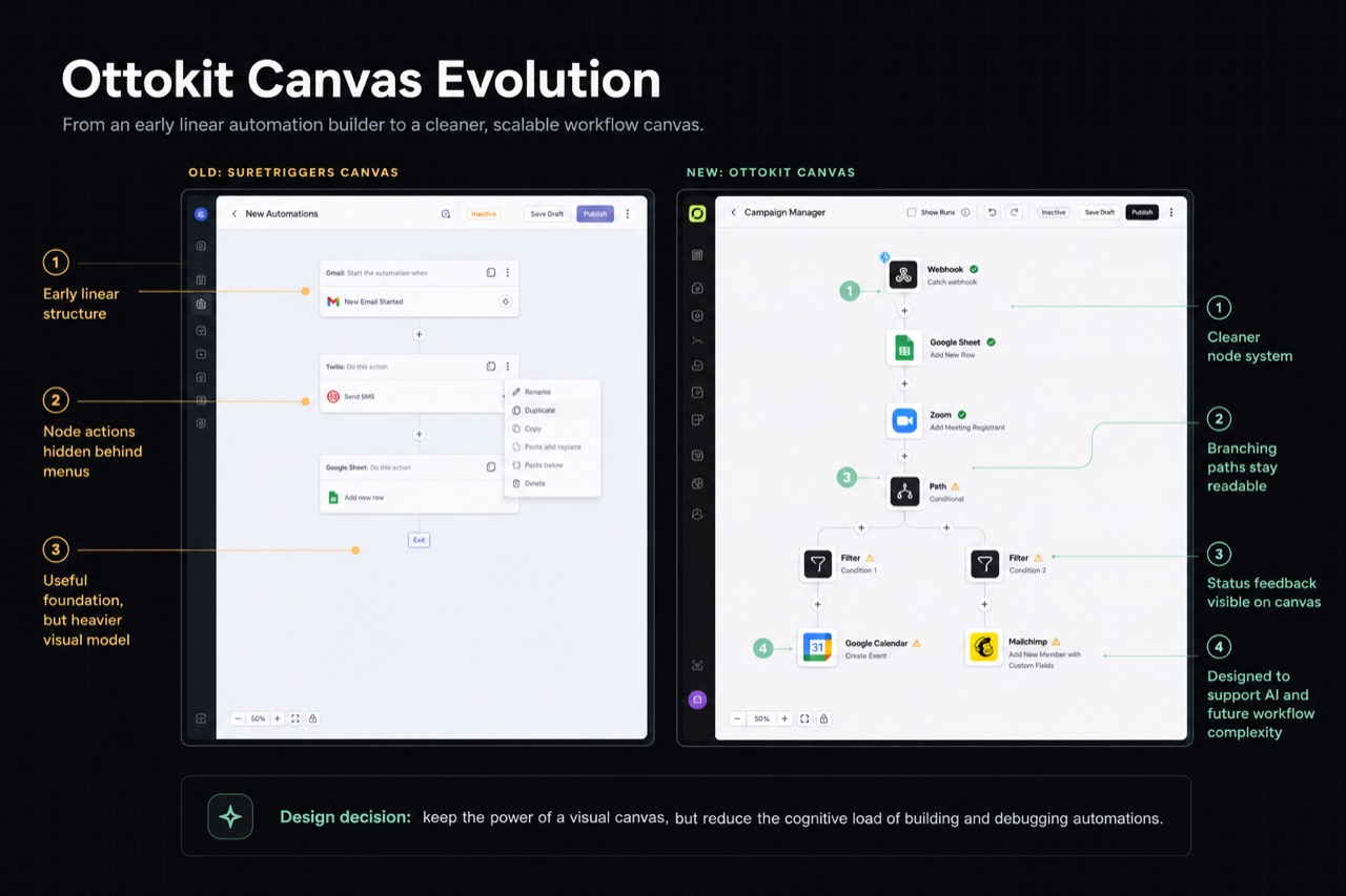
SaaS product case study · 0 to 1 · 2022–2025

Ottokit

People were signing up to SureTriggers and leaving without building a single workflow. They did not understand what the product could do until they had already given up on it. I designed Ottokit, and the SureTriggers product it grew from, to fix that: a no-code automation platform where users connect 1000+ apps through a visual canvas, and where the first five minutes of the product actually show them why it matters.

My role
Sole product designer: interaction model, flows, states, specs, implementation QA, and full design system built from scratch
Scope
0→1 product design across four major phases, 2022–2025
Team
PM, PO, and 5–10 engineers
Tools
Figma, React, Design systems, AI workflows

Outcome

First-workflow creation rate improved significantly after the onboarding redesign. The canvas architecture held across three years without a rebuild.

Ottokit Automation Builder case study cover

Overview

Making automation valuable in the first five minutes

The problem

When SureTriggers launched, automation tools like Zapier, Make, and Pabbly Connect already had the market. Competing meant being meaningfully easier, not just cheaper. The real gap was not features. Users could not get to value fast enough: they signed up, hit a blank canvas, and left before building anything. Users switching from other platforms brought another problem: the integrations they relied on elsewhere were not in SureTriggers yet. We studied what worked in those products, mapped the gaps, and built our own version of those patterns, making Ottokit feel familiar to switchers without copying how competitors did it.

My responsibility

As the only designer, I owned the product end to end: interaction architecture, flows, states, edge cases, specifications, and implementation QA. I built the entire design system from scratch in Figma: every component and every pattern, starting from zero. When we rebranded to Ottokit in 2025 and completed a full UX overhaul, I brought on a junior designer, mentored him through the product logic, set direction, and kept the new work coherent with the interaction model already in place.

How I worked

I pressure-tested direction weekly with the PM and PO, brought multiple options into reviews, and resolved ambiguity before it became expensive engineering assumptions. Mid-product, I pushed for moving our component foundation from Tailwind to shadcn because engineers were rebuilding every Figma component from scratch. A shared foundation made both sides faster, the Figma library cleaner, and the product more consistent across every new surface.

Constraints that shaped the work

  1. 01Compete in an established automation market by making the product meaningfully easier.
  2. 02Help first-time users reach a working automation within their first session.
  3. 03Make switchers feel familiar without copying competing products.
  4. 04Create an interaction model that could absorb templates, branching logic, and AI.

Key decisions

Four decisions that shaped the product

Decision 1

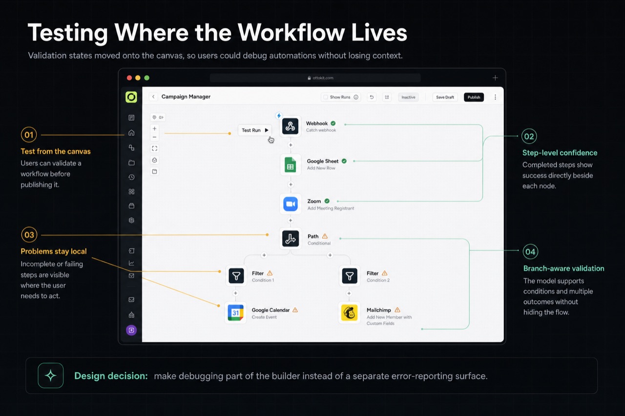
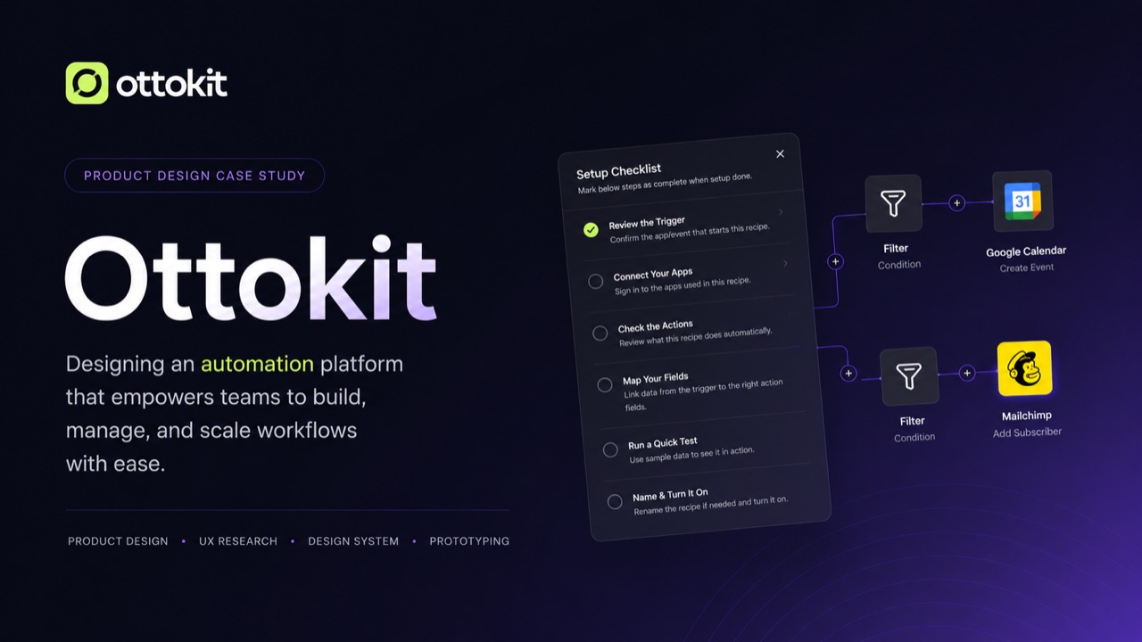
Canvas-first, but constrained by default

Context
A linear step-by-step builder was easier to learn. A visual canvas was more powerful long-term. Choosing wrong would shape every workflow interaction for years.
My decision
I chose a simplified canvas with clear node anchors and a constrained layout grid with no freeform dragging: structure by default, flexibility when needed. I also prioritised making the canvas fast and smooth because users coming from Zapier or Make already had expectations about how a canvas should feel.
Tradeoff
The canvas created more implementation complexity and made first-run guidance more important than it would have been in a linear builder.
Result
The canvas absorbed templates, multi-branch workflows, conditional logic, and AI across three years without a structural rebuild. Switchers adapted faster because the interaction felt considered, not clunky.
Annotated comparison of the older SureTriggers canvas and the redesigned Ottokit workflow canvas.
Canvas evolution from SureTriggers to Ottokit, showing how the builder moved from an early linear model into a cleaner, branching workflow system.

Decision 2

Template-first onboarding instead of more tooltips

Context
The PM, PO, and I tracked daily how many users built a workflow during their first signup session. The number was not good. Users hit seven setup steps before seeing the canvas or understanding what they were building toward.
My decision
I redesigned onboarding around templates. The first action became template selection, not a configuration screen, and I reduced pre-canvas steps from seven to three. The goal was a working automation within the first five minutes.
Tradeoff
The redesign required a template system and a new guided flow instead of a smaller patch to the existing onboarding.
Result
First-workflow creation rate on signup improved significantly. It was tracked daily and reported to the PO; specific figures are withheld under NDA.
Template-first onboarding flow showing recipe selection, guided setup, and app selection.
Template-first onboarding turned the first action into a concrete automation outcome instead of another configuration step.

Decision 3

Configure nodes without leaving the canvas

Context
Full-screen node configuration made users lose track of their workflow. They kept reopening surrounding steps to understand what fields mapped where.
My decision
I introduced a right sidebar that keeps the canvas visible while users configure the selected node: the same screen, with no context switching.
Tradeoff
The narrower surface required careful hierarchy and progressive disclosure for complex conditions and field mapping.
Result
The sidebar became Ottokit's core configuration surface and later the natural home for AI assistance and field-mapping guidance without needing a new pattern.
Ottokit canvas with a right sidebar used to configure a Google Sheets workflow step.
The right sidebar keeps configuration, guidance, and the workflow structure in one continuous workspace.

Decision 4

AI inside the canvas, not beside it

Context
The product needed to add AI without creating a second tool users had to learn alongside the first. A standalone AI chatbot would fragment the experience.
My decision
AI lives inside the existing sidebar. It generates workflow nodes directly on the canvas, users refine them through the same configuration surface they already know, and contextual guidance appears when automations hit errors.
Tradeoff
The sidebar had to support conversation, generation, error guidance, and configuration without becoming another complex product.
Result
AI launched as a native product capability. Users who tried AI-generated workflows converted to paid plans at a higher rate than those who built manually.
Ottokit AI Workflow Assistant shown inside the workflow builder with contextual debugging and action suggestions.
AI was placed inside the workflow context so users could create, debug, and add actions without learning a separate surface.

Product evolution

The product kept changing. The interaction model did not.

Across four major phases, the product expanded from a new automation builder into Ottokit with native AI while the core architecture continued to hold.

2022 · SureTriggers v1

Built 0→1 as the sole designer: canvas, trigger/action model, node configuration, dashboard, and full Figma design system, all from scratch. Shipped to paying customers.

2023 · Activation

Tracked signup-to-first-workflow daily. Rebuilt onboarding around templates, reduced pre-canvas setup from seven steps to three, and significantly improved first-workflow creation.

2024 · Canvas overhaul

Moved the component foundation from Tailwind to shadcn with engineering, rebuilt the Figma library, improved canvas speed and smoothness, and added the right-sidebar configuration pattern.

2025 · Ottokit rebrand

Used the name change as the forcing function for a full UX overhaul. Brought on and mentored a junior designer, set direction, refined the canvas and dashboard, and integrated AI as a native capability.
Ottokit workflow canvas showing test run, step-level validation, warnings, and branch-aware debugging.
Testing and debugging moved onto the canvas so validation states stayed close to the workflow instead of living in a separate reporting surface.

Impact

What changed

  • 0→1built as sole designer, from first canvas to paying customers
  • 7→3onboarding steps before a user reaches their first automation
  • Dailyfirst-workflow creation tracked; improved significantly post-redesign (NDA)
  • 3 yearssame canvas architecture across two product identities and four phases
  • Higherpaid conversion among users trying AI-generated workflows versus manual

Impact statements reflect internal product signals and qualitative feedback from the source case study.

Reflection

What I would do differently

  1. 01Test onboarding with real users before launch. Two usability sessions could have exposed the seven-step activation problem before six months of product data and engineering rework.
  2. 02Mentoring the junior designer showed me how much of the interaction model lived only in my head. Onboarding someone else into the product forced me to document decisions I had been making intuitively, and that made the product better.
  3. 03The shadcn call taught me that design decisions and engineering decisions are not separate conversations. Pushing for a shared component foundation saved both sides time and made the product more consistent than it would have been if I had stayed in my lane.